Canada Duty Free
We worked with ARI North America to create an identity for Canada's Duty Free shops. This design takes unique identifiers from four different Canadian cities that make them distinctive in a way that holistically create a Canadian identity. These different elements are subversive, honest and lighthearted in their approach.
We created marks that have organic curvatures that are friendly and have a sense of familiarity, without drawing on clichés that represent these cities. We drew on the rich design scene of Canada and airport signage with minimal marks with a sense of character and personality, creating a system that is scalable, distinguishable and amplifies a Canadian sense of place.
Each Duty Free store celebrates its respective city with a unique illustrated icon representing the famous landmarks or regional qualities of the area. Montreal is symbolised by the Jacques Cartier Bridge, Halifax by an anchor reflecting its maritime identity, Québec by a fleur-de-lis representing its French population, and Winnipeg by a snowflake, symbolising its distinctive climate.
The brand incorporates orange and yellow colours, symbolising the dynamic hues of maple leaves and the evolving identity of Canada. This colour palette evokes a sense of familiarity and Canadian identity, steering away from the conventional red found in the Canadian flag.
The identity is designed to seamlessly integrate into airport signage while maintaining its distinctiveness and uniqueness. This approach aims to establish a sense of familiarity, recognition, and legitimacy. The icon design is versatile, easily adaptable for use on stickers and merchandise to effectively represent the store.
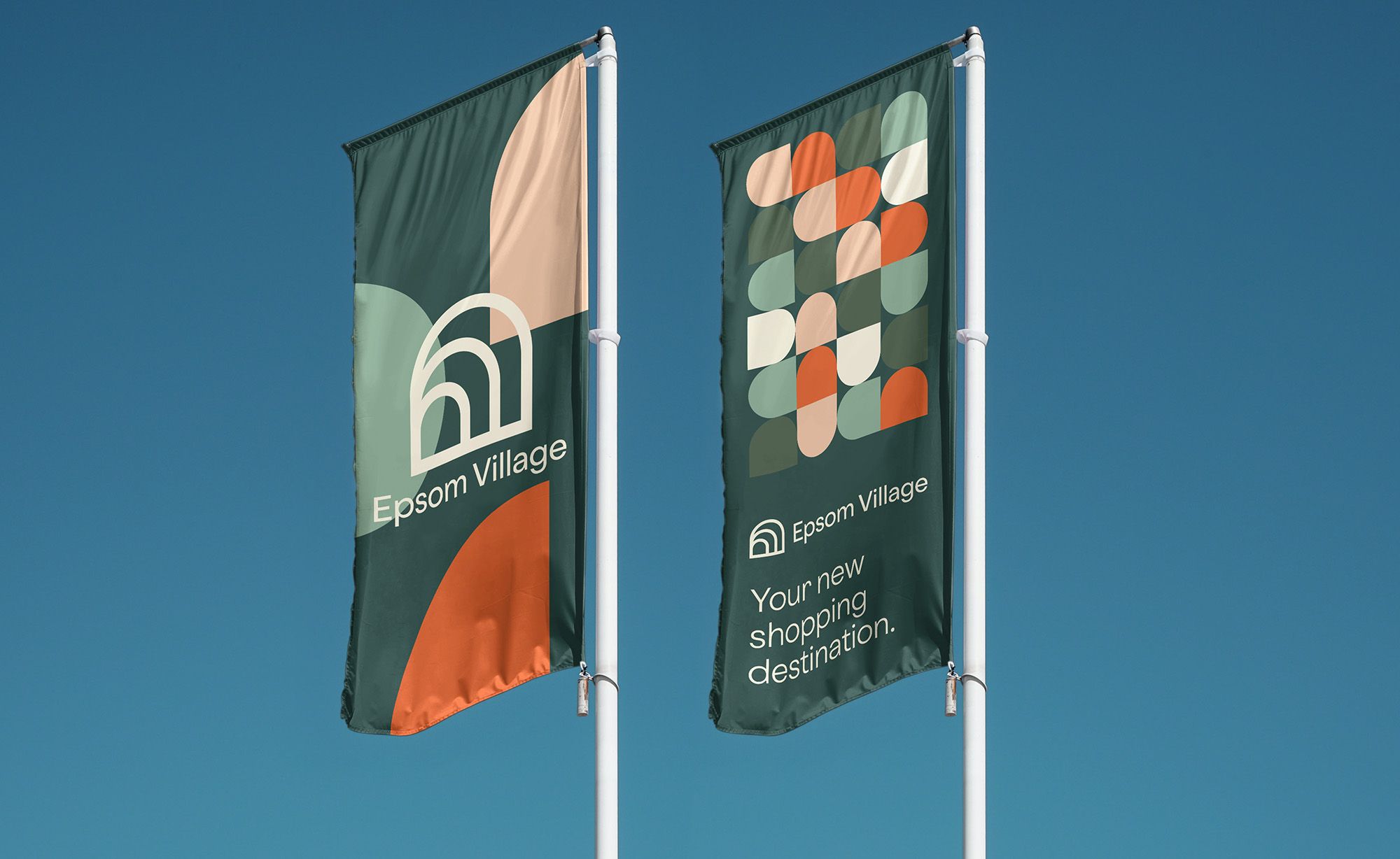
Epsom Village is a colorful shopping community in Epsom, Victoria that has become the fastest growing retail centre in the fastest growing residential catchment of Bendigo, Victoria.
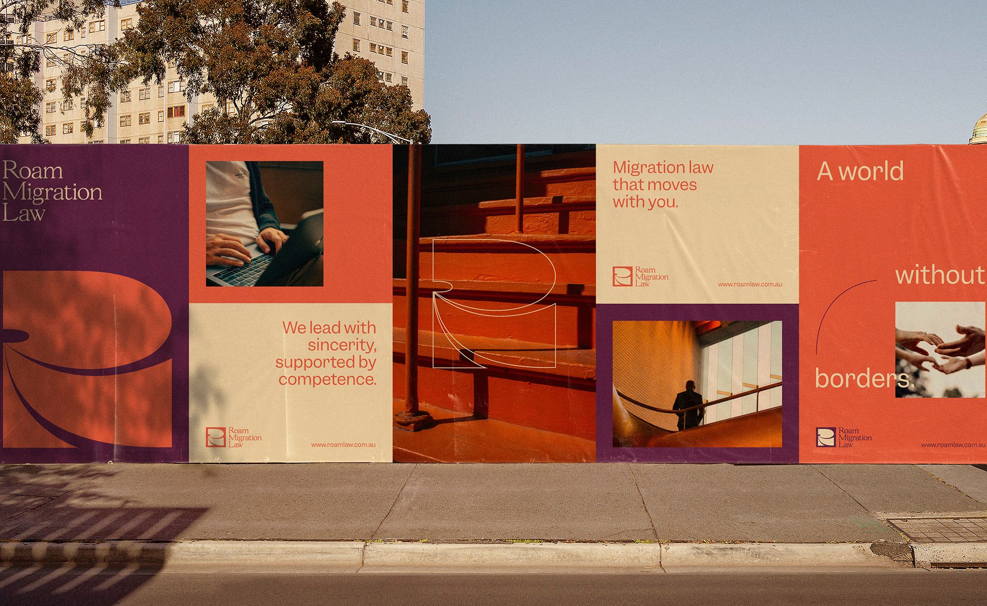
Roam Migration Law is an Australian immigration law firm. For this brand, we wanted to express the idea of a world without borders and one that celebrates the movement of people, whether for work or for love.
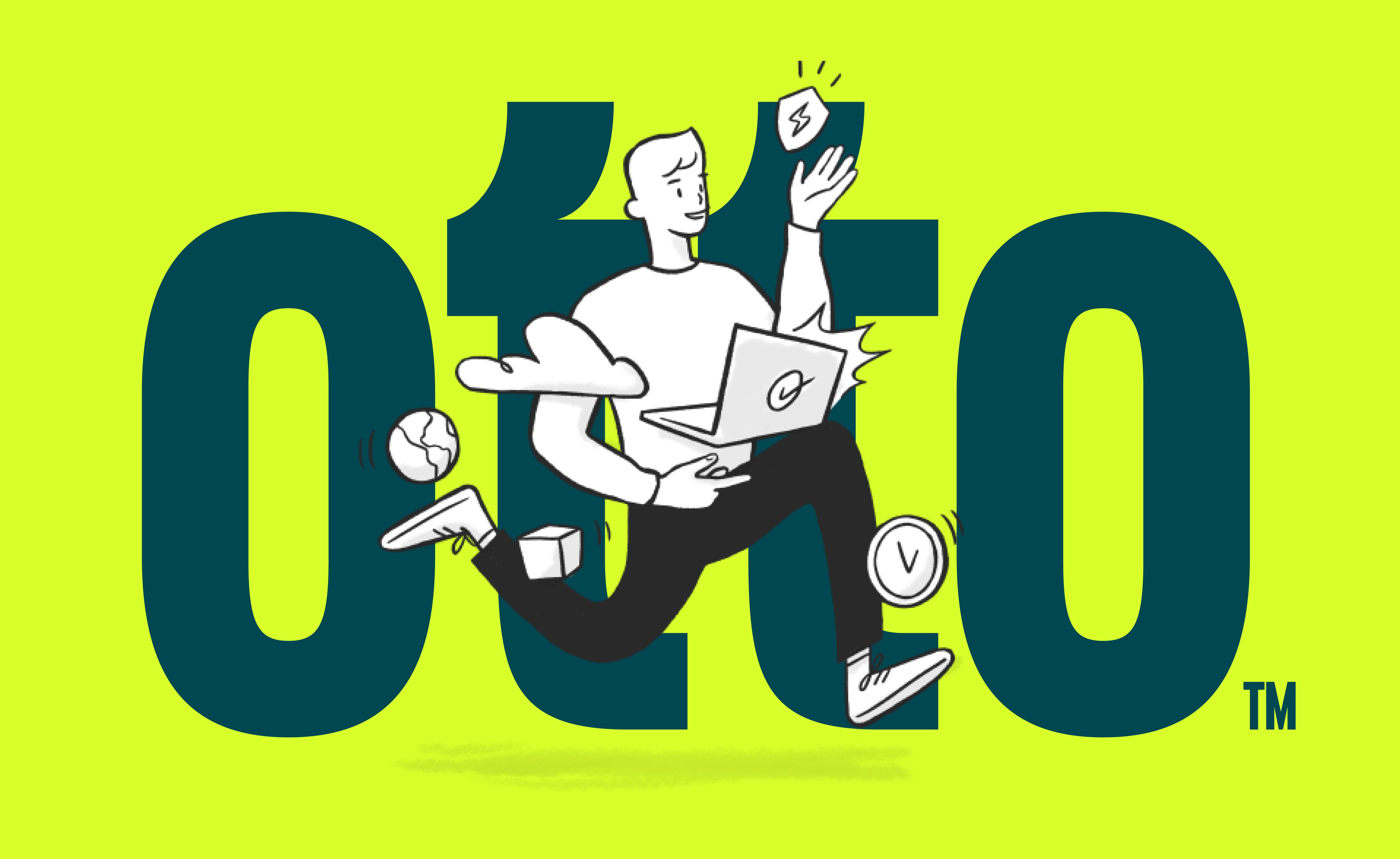
Otto challenges the traditionally cold IT industry, it personifies what IT should be — Humanising Technology. Otto was born from a merger between two businesses, requiring a new name and identity to capture their new phase.


