Liptember Foundation
Liptember is a trusted source and respected leader when it comes to women's mental health. After our successful campaign rebrand of Liptember, we were approached to create a new separate brand to be reflective of the growth they’ve had as a Foundation over the years.
Our approach to the branding is earthy, strong, unique and bold – an evolution from the bright pink, red and blue colour palette of the past into the mature, connected and inclusive burgundy, blush and slate.
The new logo mark, referencing a window frame, was crafted to represent transparency, visibility, trust and connectivity. The idea was inspired by the many different mental health stories shared by women, through a gendered lens and the values underpinning the Liptember Foundation.
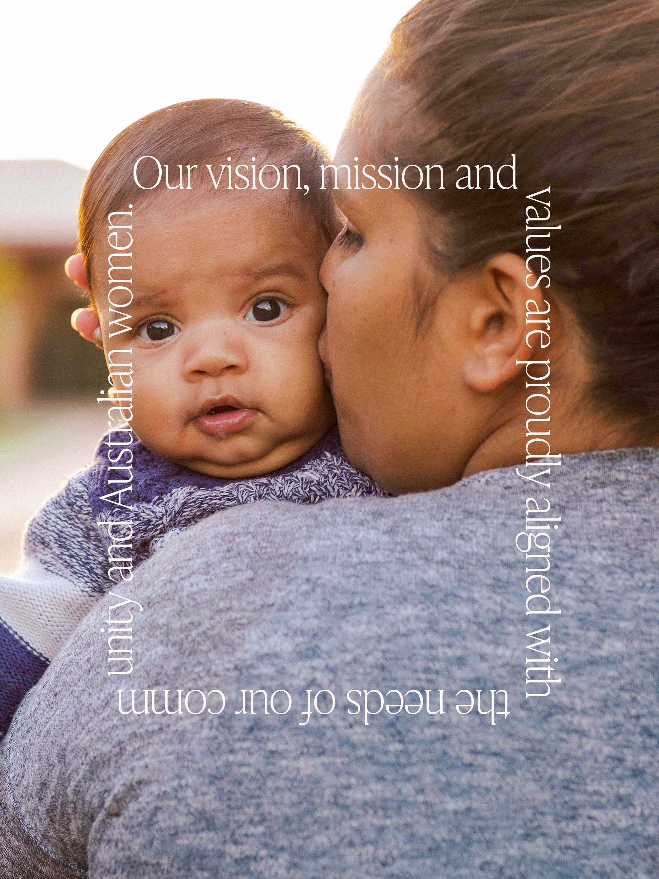


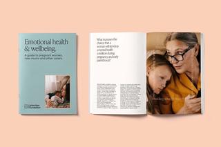
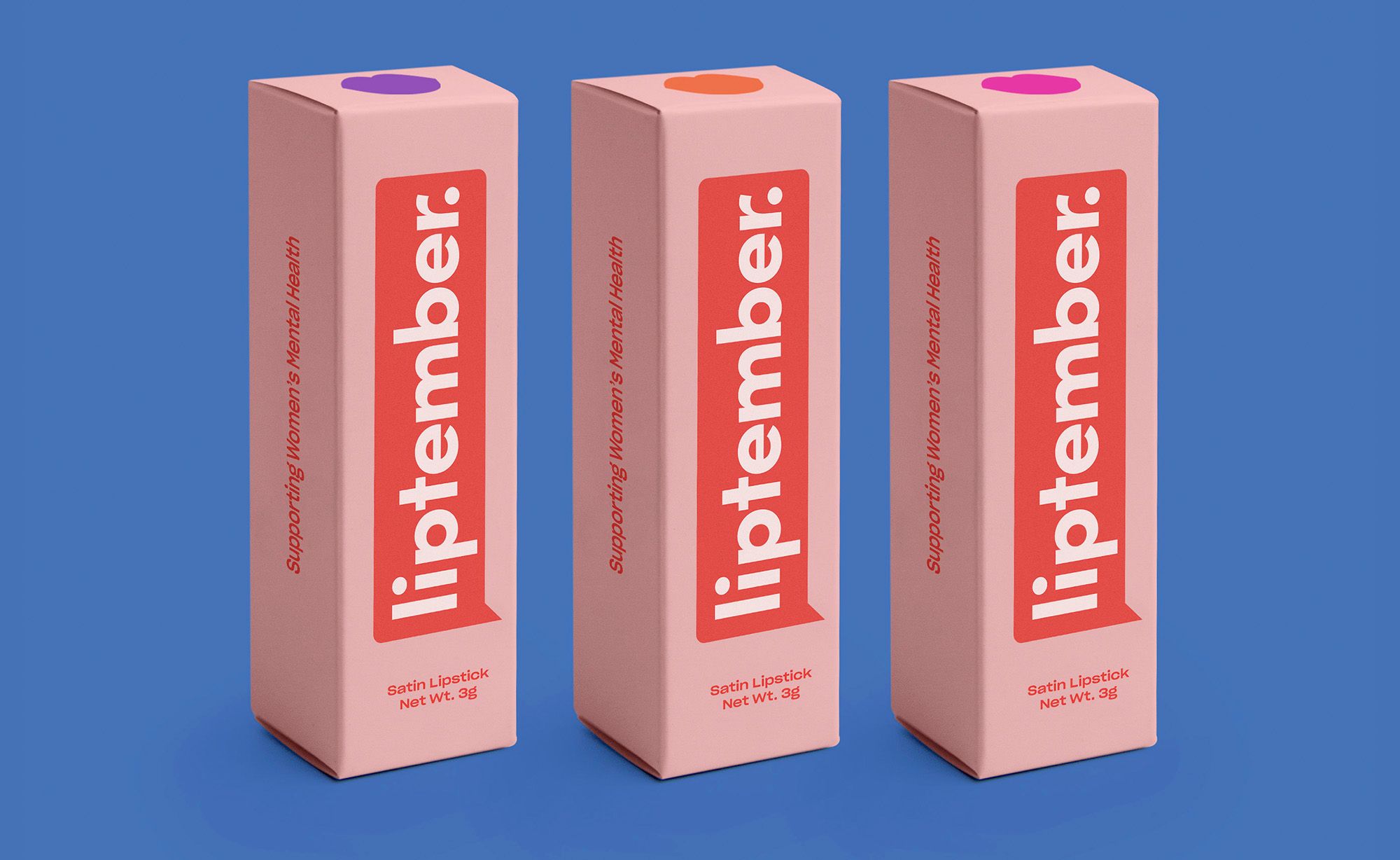
Liptember is a charity focused on creating awareness around women’s mental health, with funds raised by participants purchasing and wearing a colourful lipstick throughout the month of September.
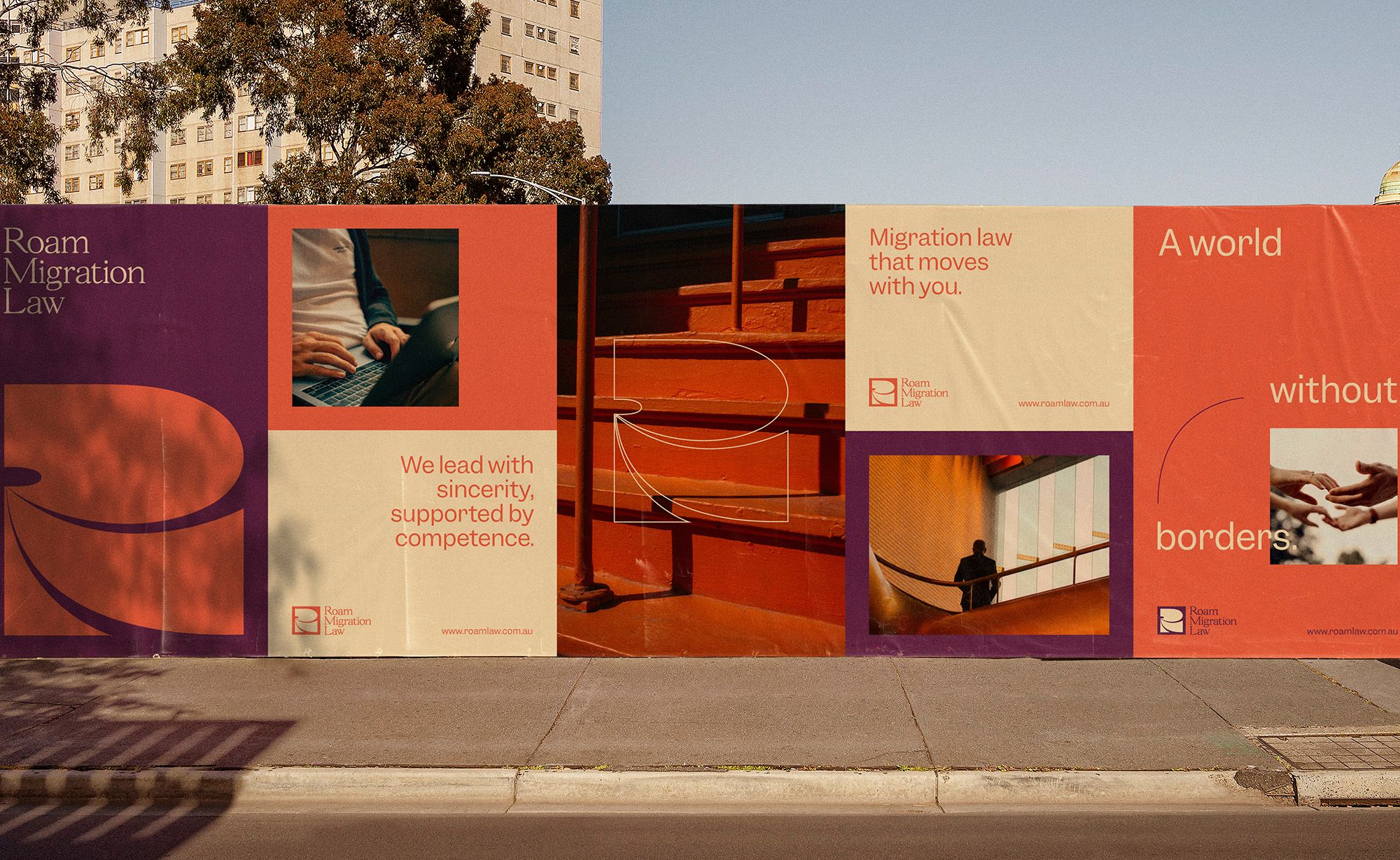
Roam Migration Law is an Australian immigration law firm. For this brand, we wanted to express the idea of a world without borders and one that celebrates the movement of people, whether for work or for love.
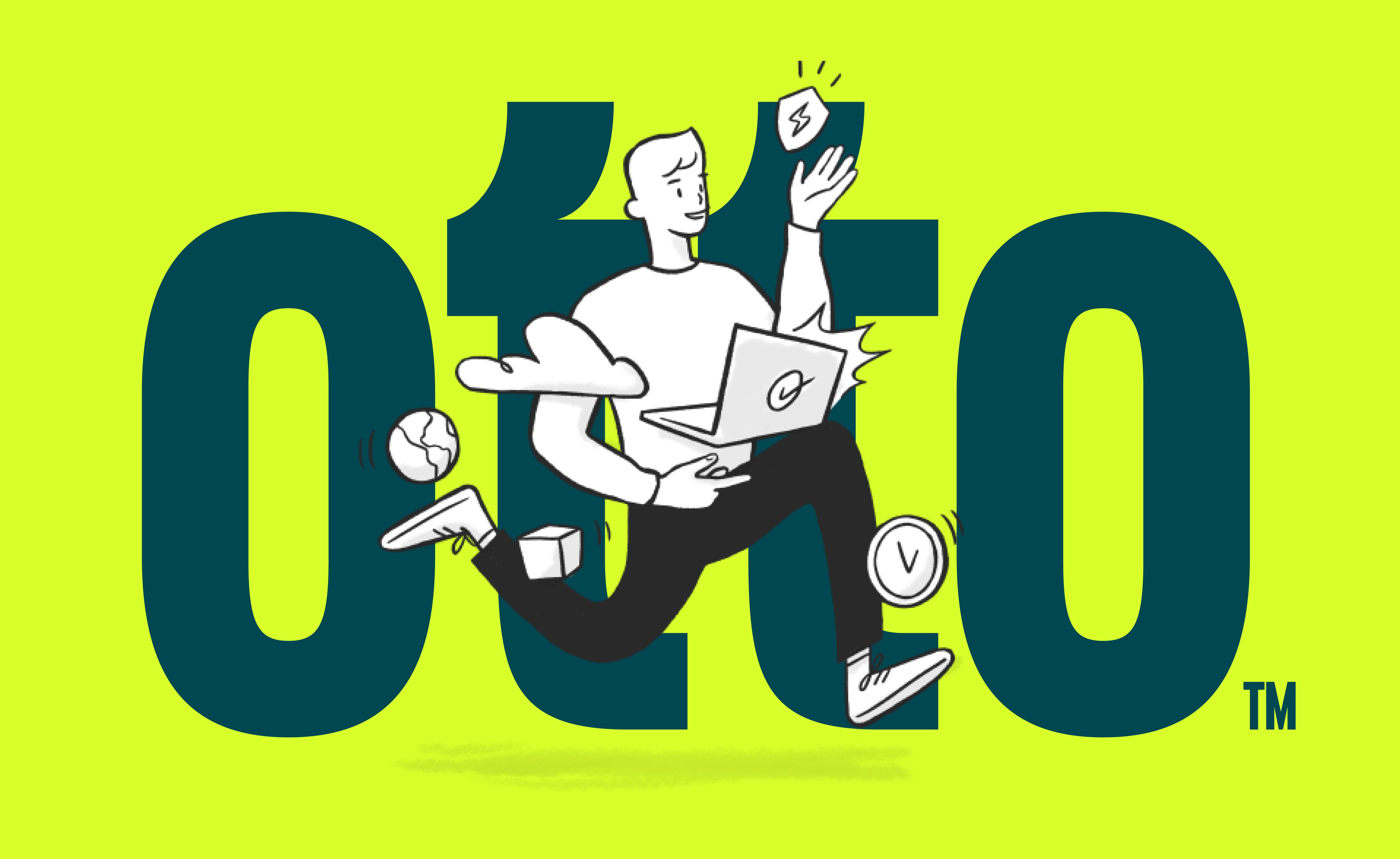
Otto challenges the traditionally cold IT industry, it personifies what IT should be — Humanising Technology. Otto was born from a merger between two businesses, requiring a new name and identity to capture their new phase.