Moments
We were approached to reintroduce Moments to a market saturated with stereotypes, predominantly targeting a male audience. We repositioned Moments for a contemporary, body-positive audience, infusing the brand with an unexpected, quirky, and fun approach.
Taking cues from the vibrant culture of our target demographic we’ve introduced colours to pack an eye-catching punch. With immediate shelf-appeal and bold typography choices it’s easy to see why this will quickly become the brand of choice for women, men and everyone in between.
It’s a far cry from what is often seen in the mainstream intimacy space. It’s a Moments moment. And the world has never been more ready. It's our pleasure to introduce the new look Moments.

Drawing inspiration from the original branding and packaging, we elevated the brand with a series of distinctive elements designed to create a memorable and unique identity. We introduced a flowing 'M' monogram as a signature brand mark for Moments, instantly recognisable and versatile, serving as both a standalone icon and a dynamic background element.
This was complemented by a bold purple as the primary brand colour, establishing a unique colour scheme within the sexual wellness space that subverts traditional gender norms and stereotypes.


Recognising the brand’s diverse product categories, we developed a system of unique frames to visually represent the essence of each moment. A thin rounded border for ultra-thin, a wavy border for flavours, a scalloped border for textured, and a zigzag border for vibrating toys. This visual language, paired with bold colours that capture each variety's personality, creates a brand identity that engages all the senses.


Building on the branding that represents all the senses, we carried this concept into the packaging, where tactility became the main focus. Each product variety and texture is celebrated with a blind emboss texture on the side of pack, allowing the touch and feel of the packaging to reflect the unique qualities of each product.

As an extension of the existing condom range, the branding was expanded to include a self pleasure toy line, positioning Moments as a body-positive intimacy brand. With bespoke luxury packaging and fun, vibrant colours, the toys were designed to break taboos around self-pleasure.


To launch the new look for Moments, we developed a suite of digital and print advertising collateral that captured the brand's essence through dynamic movement, vibrant colour, and striking imagery. With a punchy and unapologetic tone of voice, the campaign positioned the brand as bold and attention-grabbing, ensuring it made a strong impact.


Meet your new main squeeze, ROCC — the toothpaste that thinks about footprints almost as much as teeth.
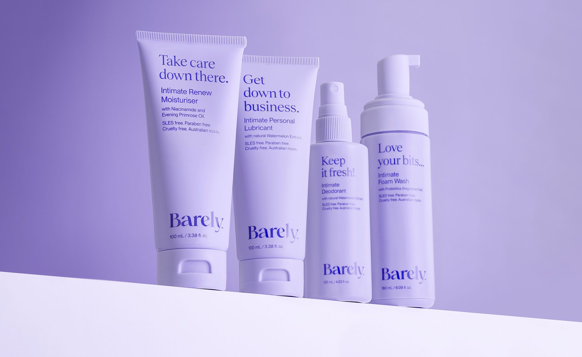
Barely is an Australian-made intimate skincare brand that’s all about the good stuff for your good bits. We developed a visual language and tone of voice that speaks to women who understand their bodies inside, out.
LVL UP is an electrolyte powder with great flavour and next-level hydration. It's where flavour meets function, with added vitamins and electrolytes, it packs more into your day. From tangy lime to sweet summer berry, it's flavours help you re-fuel – fast.